
A smooth start is more than a nice first impression. It is the quiet moment when someone opens a page, taps a screen, or enters a system and immediately feels, “Okay, I know what to do.” That feeling is not luck. It is built on choices that respect people’s attention, time, and goals. When the first step is obvious, people move forward without hesitation. When they keep moving, the finish becomes strong and steady, not stressful or rushed.
Digital projects often focus on results at the end of the journey. Numbers, launches, milestones, and outcomes matter, of course. But the path to those outcomes is paved in the beginning. The early moments decide whether someone trusts the experience, understands the value, and wants to continue. If the start is cluttered, slow, or confusing, the rest of the work is forced to compensate. If the start is calm and clear, everything that follows becomes lighter.
At Webdev200, we build experiences that make the first step obvious and the last step effortless. That line is not a slogan. It is a practical way of thinking about every project we touch, from website development to mobile apps, from business applications to interactive design. The aim is always the same: reduce friction early so momentum can carry people through the middle and across the finish line.
First impressions people can actually use
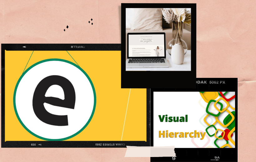
When people arrive somewhere new, they want signals they can trust. A calm layout, readable text, and clear visual hierarchy help them understand what to do before they even think about it. The first few seconds decide if they lean in or drift away. That’s why user experience is never a final polish. It is the foundation. It begins at first contact.
Clarity in early moments reduces mental load. It prevents hesitation. It keeps people from scanning aimlessly, clicking randomly, or second-guessing themselves. Simple cues can carry a lot of weight: visible navigation, obvious actions, and consistent patterns that match what people already know. When the brain doesn’t have to decode the interface, it stays focused on the goal.
Even tiny details matter here. Spacing that feels breathable. Buttons that look clickable. Labels that speak human language. Predictable pathways that avoid surprises. These are not surface decisions. They are trust decisions. When the start respects attention, people give more of it back.
A smooth beginning also makes room for identity to land. The way something feels at entry shapes what someone believes about it. Not through heavy messaging, but through tone, balance, and intention. Early clarity becomes emotional clarity too. People think, “This makes sense,” and that sense becomes confidence.
Strong finishes often come from invisible structures. A journey stays steady when the environment behind it is organized, consistent, and scalable. That is where website development fits in. It is not just about building pages. It is about building a space where every step feels connected.
Steady structure keeps people from falling into gaps. No dead ends. No confusing loops. No sudden shifts that feel like they belong to a different world. When layouts follow a logic, people don’t need to relearn the experience every time they move forward.
Structure also protects growth. As content expands, a strong system prevents clutter. It keeps navigation clean even when options multiply. It makes updates smoother because everything already has a place to go. With the right foundation, the experience stays calm even as it becomes more capable.
A quiet structure also supports outcomes. If a path is clear, people follow through. If the flow feels natural, more people complete what they came to do. That’s the heart of conversion optimization when it’s done right. Not pressure. Not tricks. Just removing friction so progress feels easy.
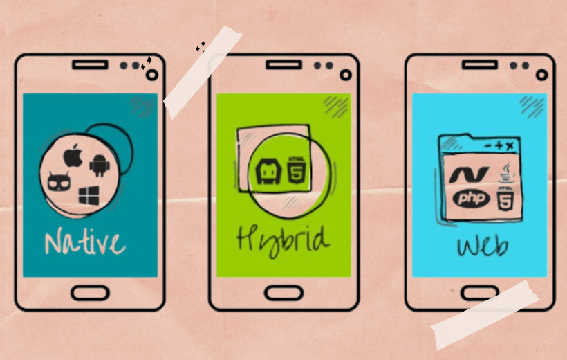
Mobile Journeys Designed for Natural Flow
Phones are small, but expectations are huge. People want speed. They want simplicity. They want to feel in control with one thumb and half their attention. That makes smooth starts even more critical on mobile. If the first touch feels heavy, the journey breaks right away.
Great mobile apps feel familiar from the first second. The gestures make sense. The navigation feels predictable. The main actions are easy to spot. Instead of forcing people to adjust, the experience adjusts to them.
Natural flow on mobile comes from respecting context. Someone might be standing in line, riding in traffic, or switching between tasks. They don’t want extra steps. They want the shortest path that still feels safe and clear. So the start should guide without giving a lecture.
When mobile journeys are designed with care, they hold attention longer. People return because the experience stays consistent. The finish becomes strong because the middle never demands unnecessary effort. Every tap feels like progress instead of labor.
Internal Systems That Support Real Work
Not every journey is public. Some of the most important experiences happen inside teams, where speed and clarity directly shape daily performance. A smooth start here means adoption without friction. People should be able to open a tool and understand it quickly, without a manual or a meeting.
That’s why business applications must be built around real behavior, not ideal behavior. People move fast. They multitask. They forget where things live. They need systems that guide them gently, even when they’re not looking for guidance.
Internal clarity is also about reducing repetition. When steps repeat, energy drains. When workflows crunch time for no reason, resentment builds. Smart systems remove those slow points. They automate what should be automatic, and elevate what should stay human. That’s the quiet power of workflow automation when it’s done thoughtfully.
The result is steadier work. Fewer mistakes. Cleaner handoffs. A middle that doesn’t collapse into chaos. And a finish that feels reliable because the system carried its share of the weight.
Interactive Elements That Create Gentle Guidance
Interactivity should feel like a helpful nudge, not a noisy interruption. When people meet at an interactive moment, they should sense direction without being pushed. Done well, interaction builds momentum. It makes the next step feel lighter.
That kind of impact is what interactive design is really for. It is not decoration. It is guidance through movement, feedback, and subtle reinforcement. A micro-animation that confirms an action. A progressive reveal that keeps attention focused. A responsive element that reduces uncertainty.
Interactivity also helps people learn without feeling taught. When the system responds naturally, people build confidence by doing. That confidence keeps them moving. It turns the middle of the journey into something fluid, not fragile.
The best interactive layers also reflect intention. They match the overall feel. They don’t fight the interface. They simply make progression more obvious, so the finish stays steady.
Quiet Direction Toward Confident Completion
A finish feels effortless when someone never had to guess along the way. That is the role of digital strategy. It sets priorities early. It defines what matters most. It protects the project from drifting into noise.
Strategy begins by understanding goals, then stripping away what doesn’t serve them. It creates a path where each step helps the next one make sense. Without this kind of direction, even great design can feel scattered. With it, everything works together.
Quiet direction also includes thinking about how things will live after launch. How new content will fit. How future features will stay consistent. How teams will maintain the work without stress. A strong finish is not just a moment. It is stability after the moment.
This is also where product design plays a deeper role. It bridges intention and practicality. It translates direction into real steps that feel human. It makes sure the thing you build is not only functional, but comfortable to use again and again.
If you’re planning something new, or refining something that has grown heavy over time, the smartest move is to begin with the start. Ask what the first step should feel like. Ask what someone needs to understand in three seconds. Ask what would remove hesitation before it appears. Those answers lead to stronger finishes, because they create journeys people can actually carry.
When you’re ready to shape an experience that starts smoothly and finishes strong, Webdev200 is here to build that path with you, with calm beginnings, steady momentum, and outcomes that feel complete.