


Modern Screen Habits and Connected Digital Experiences
Software no longer lives on one screen. A person may begin a task on a desktop at work, check information on a phone later, and return through a tablet at home. Each device changes the available space and the way someone interacts with content. Therefore, digital products need to account for these changes from the beginning.
Webdev200 works across digital projects where adaptable experiences can support different business goals. The central idea is simple. Software should remain understandable when the screen changes. A smaller display should not turn a useful interface into a crowded collection of buttons, text, and forms.
Good web design helps establish that flexibility. Visual hierarchy can show which information deserves attention first. Clear spacing can separate actions from supporting details. Meanwhile, readable type and familiar navigation can help people understand where they are without searching through every part of the interface.
However, adapting software involves more than reducing the size of desktop content. A phone has different physical limits and interaction patterns. People tap instead of using a mouse, while smaller screens leave less room for several panels at once. Consequently, designers need to decide which information should appear first and which details can remain available through another view.
A strong user experience considers these practical differences. Forms should remain manageable. Buttons should have useful touch targets. Important messages should stay visible. In addition, users should not lose essential functions simply because they moved to another device.
Consistency still matters across screens. A person who learns how an application works on a laptop should recognize the same main actions on a phone. Yet consistency does not require identical layouts. Instead, each version can adapt while preserving familiar labels, priorities, and interactions.
An adaptable product can also strengthen an organization’s online presence because customers increasingly encounter digital experiences from many devices. A difficult mobile experience may create frustration even when the desktop version works well.
The goal is not to predict every screen that will ever exist. Rather, teams can create flexible foundations that respond well to common device sizes and changing user needs. That approach makes software more practical in a world where digital work and everyday activity regularly move beyond the desktop.
Mobile Priorities and Flexible Interface Decisions
Smaller screens force teams to make deliberate choices. A desktop interface may have room for navigation, filters, charts, forms, and supporting information at the same time. A phone cannot show all of those elements comfortably. Therefore, adapting software requires prioritization rather than simple compression.
Mobile development connects directly with this challenge. Depending on the project, a business may need a mobile friendly web experience, a dedicated mobile application, or another approach suited to its users and requirements. The right choice depends on what people need to accomplish, where they use the product, and which device features matter.
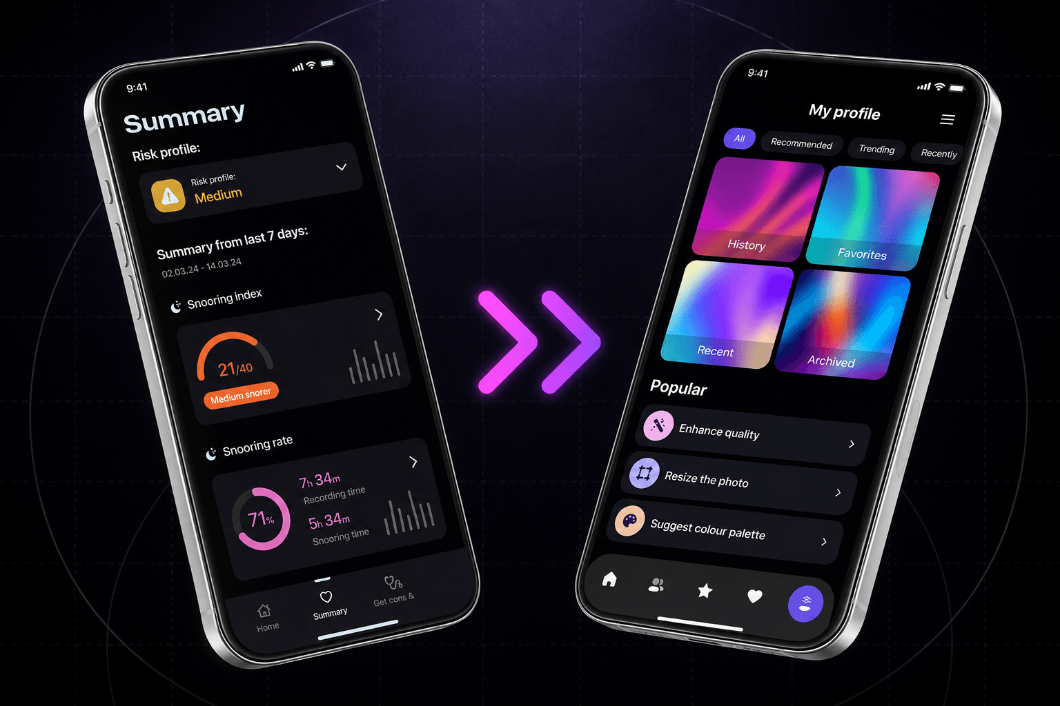
Responsive design supports web experiences by allowing layouts to adjust across different viewport sizes. Columns can reorganize, navigation can change, and content can occupy the available space more effectively. However, responsiveness should preserve useful information rather than hide important features simply to create a cleaner screen.
Consider a business dashboard. On the desktop, several data panels may appear together for comparison. On mobile, stacking every panel into one long page may make information difficult to scan. Instead, designers can prioritize key summaries and provide clear access to deeper details when users need them.
Forms require similar care. Long fields, small controls, and complex tables can become difficult on a phone. Therefore, teams can simplify input where appropriate, group related information, and use controls that work well with touch. Clear validation also helps people correct mistakes without searching through an entire page.
A web developer can translate these interface decisions into practical behavior across browsers and devices. Reusable components can help maintain consistent buttons, inputs, navigation, alerts, and other common elements. Moreover, testing can reveal issues that are easy to miss when teams only resize a desktop browser during development.
Performance matters too. Mobile users may encounter different connection speeds or device limits. Large images, excessive scripts, and unnecessary requests can make software feel slow. As a result, teams should consider page weight and loading behavior alongside visual adaptation.
Thoughtful website development also includes testing real tasks. Can someone complete a form on a small screen? Can a customer find account information without excessive scrolling? Can a user return to an unfinished task without confusion?
These questions keep the work grounded in practical use. Every screen presents different limits, but good decisions can preserve the purpose of the software across them.
Broader Digital Support and Long Term Product Value
Adapting software across screens is not a one time design task. Devices change, operating systems evolve, browsers receive updates, and user habits shift. Businesses also introduce new features as their needs grow. Therefore, adaptable digital products benefit from planning that considers both current use and future changes.
A broad range of digital capabilities services can support that process when each one addresses a clear business requirement. Web Development, Business Applications, Mobile Development, Interactive, and Marketing & Branding can contribute to different parts of a digital project. The right combination depends on the product rather than a fixed formula.

For example, website design can establish visual rules that remain recognizable across screen sizes. Typography, spacing, interface elements, and navigation patterns can create familiarity. Yet these choices should remain flexible enough to adapt when available space changes.
Teams should also test important workflows instead of judging success from screenshots alone. A layout may look polished while still making a common task difficult. Therefore, usability checks should include realistic actions such as signing in, completing forms, finding records, reviewing information, and moving between key areas.
Accessibility belongs in the same conversation. Keyboard access, readable text, clear labels, meaningful feedback, and suitable contrast can improve software for a wider range of users. In addition, accessible thinking often encourages simpler interactions that benefit everyone.
Businesses should also consider maintenance. If every screen uses completely different code or interaction rules, future updates can become harder to manage. Shared components and consistent design decisions can make changes easier while still allowing layouts to respond to different devices.
Analytics and user feedback can reveal where problems remain. High abandonment on a mobile form, for example, may justify closer review. However, data should lead to investigation rather than automatic conclusions. Teams still need to understand why users encounter difficulty before deciding what to change.
Ultimately, building beyond the desktop means respecting how people actually use digital products. They move between devices, locations, and screen sizes while expecting their work to remain understandable.
A successful product does not force every device into the desktop model. Instead, it preserves important tasks while adapting presentation and interaction to the available screen. For organizations planning a more flexible digital experience, contact us to discuss an approach that supports practical use today while leaving room for tomorrow’s devices and business needs.