


Familiar Cues and First Impressions Across Digital Platforms
Branding can shape a choice before someone compares every detail. A visitor sees a name, reads a line of copy, and decides whether to keep looking. Those quick reactions matter, but a logo alone rarely settles the decision. People also notice whether a business makes its offer easy to grasp and its claims easy to check.
Webdev200 brings website design, development, and brand work into the same conversation. Its site presents options for digital products, visual identity, marketing, and ongoing site care. That range matters when a company wants the message on its website to match the way the website works. A polished page can catch attention, while a clear next step helps visitors use what they find.
Think of a customer looking for a local service. Two businesses might offer similar work, yet one site names its process, shows recent examples, and answers common questions. The other asks visitors to guess what happens after they make contact. The customer may favor the first option because its details feel easier to assess.
That is a useful way to think about choice. People bring needs, experience, timing, and budget to each decision. Branding cannot erase those factors, and no design can promise a sale. Still, consistent information can help someone compare options with greater confidence. It also gives a business a fair chance to explain what makes its offer relevant.
A clear online presence supports this first exchange. Visitors should find the same business name, offer, and contact details wherever they encounter the company. They should also recognize the same plain language on a search result, a landing page, and a contact form. Each touchpoint can confirm what the last one suggested. When the details agree, people spend less effort checking whether they have reached the right place.
Customer Motives and Trust Signals Across the Buying Journey
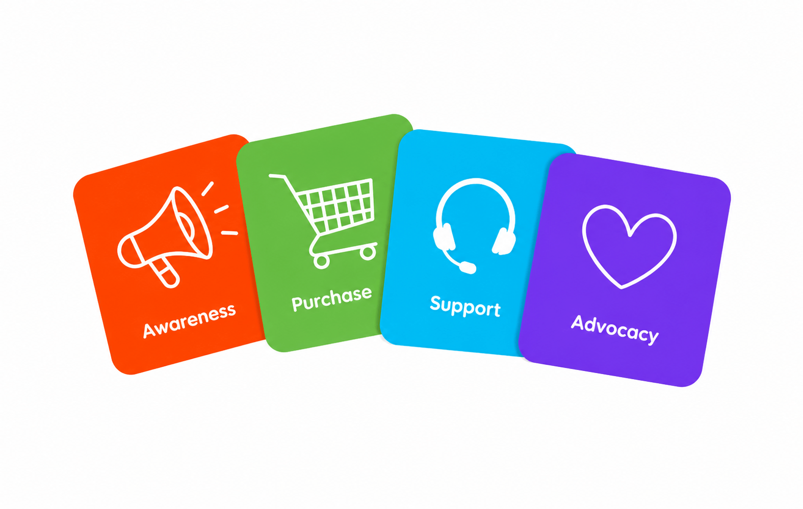
In practice, marketing & branding connects the promise a company makes with the evidence a customer can see. Marketing helps people discover an offer and understand when it matters. Branding gives that offer a distinct name, voice, and set of expectations. Together, they influence what customers notice first and what they remember after leaving a page.
Start with the job the customer needs to finish. Someone choosing a booking tool may care about speed, while someone choosing an adviser may want clear answers before making contact. Those priorities should guide the message. A headline can name the need, a short example can show how the business responds, and a useful FAQ can clear up doubt. The point is to help a person decide whether the offer fits.
Customers often look for signals they can verify. Specific descriptions, accurate contact details, relevant work samples, and straightforward policies give them more to judge than a vague promise. A testimonial may add context when a business has permission to use it and presents it honestly. However, no single quote proves that every customer will get the same result. Strong brand communication stays precise about what the business can provide.
Choice also depends on how much effort the customer must spend. In effective web design, the page gives its main point enough space and makes important information easy to find. Labels should match what people expect to see when they click. For example, a page called Pricing should explain costs or the way a quote works. If the page hides basic answers, even attractive visuals can leave visitors uncertain.
A good user experience lets people complete a task without guessing. Someone may want to compare options, ask a question, or book a call. Each action needs a clear path with a useful result. Forms should request information that the business needs and error messages should explain how to fix a problem. Small choices like these show respect for the visitor’s time.
Consistency makes the message easier to recognize across different settings. A product page, an email, and a social post can use different formats while keeping the same facts and tone. Repeating a core promise is useful when each format adds a practical detail. Repeating empty claims, however, gives the customer little new information. A recognizable brand comes from clear choices that hold up from one contact to the next.
Visual choices can help, although they need a purpose. A readable typeface makes details accessible, while photos can show the product or the people behind a service. Color can draw attention to an important action, but color alone does not explain why to act. For that reason, words and visuals should work together. Each should answer a question the other cannot answer as well.
Customers also use comparisons, even when they never open a comparison chart. They may check opening hours, support options, delivery terms, or the steps in a project. A business can help by stating those details plainly and keeping them current. If a claim changes, the site should change with it. Trust grows when the experience matches the promise people read before they get in touch.
Search can bring the first visit, but search visibility is only the beginning. Thoughtful SEO helps a page address the terms and questions that matter to its audience. Once visitors arrive, they still need useful content that answers the query. A page built for a broad phrase should explain the subject clearly instead of forcing the same words into every paragraph. Relevance is easier to feel when the answer is actually there.
Practical Touchpoints and Clear Next Steps for Buyer Choices
Digital services turn a brand idea into things a customer can use. A business might need a clearer home page, a working contact form, or content that explains an unfamiliar offer. The right starting point depends on where visitors become confused or leave with questions. Reviewing actual pages and customer inquiries can reveal that problem more clearly than choosing a new look on instinct.
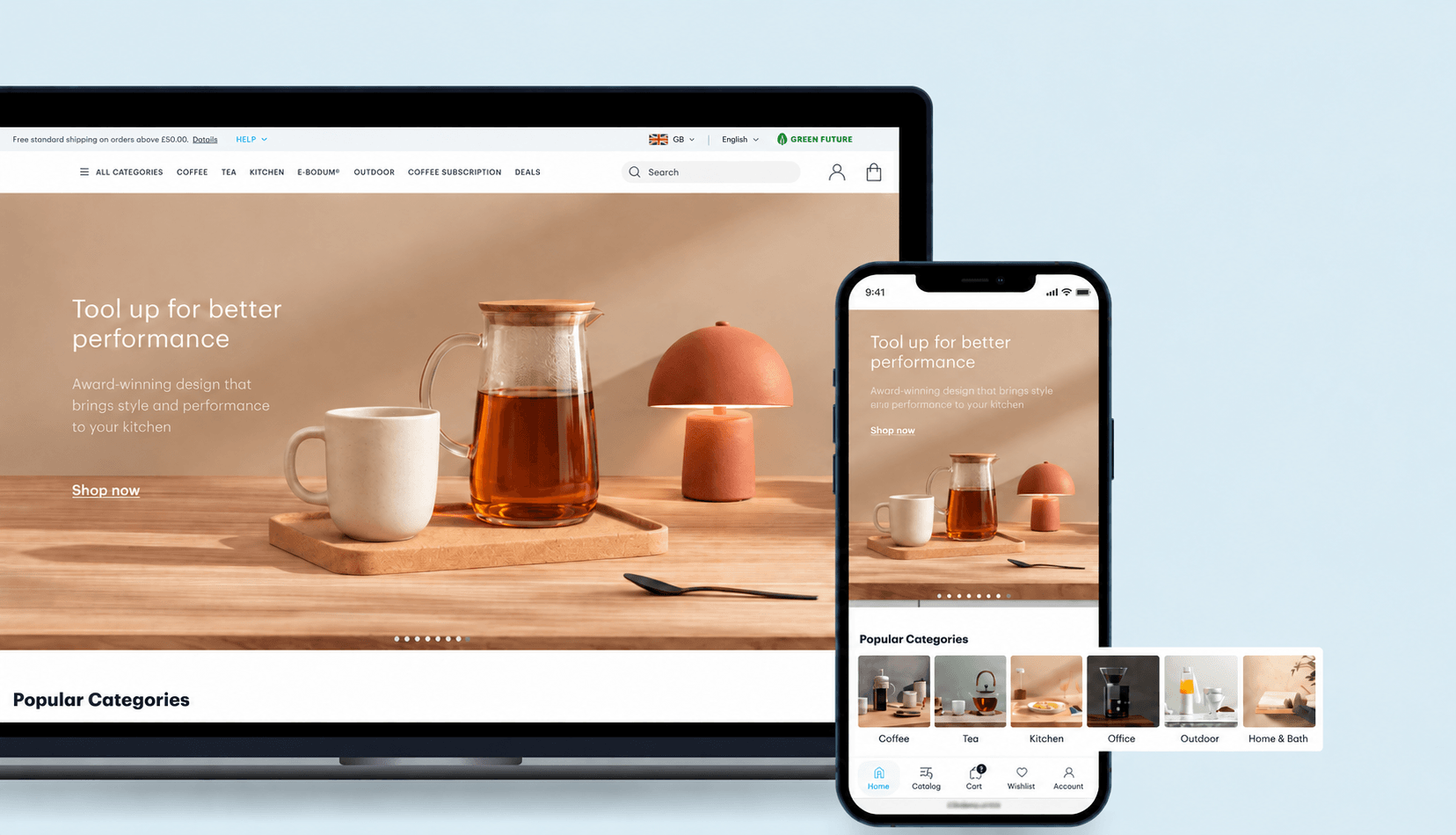
Consider responsive design when customers move between phones and larger screens. Text should remain readable, controls should be easy to tap, and the main message should stay clear at each size. These are practical conditions for access, not decorative extras. A customer who can find the answer on a phone has one less reason to stop the search.
The same care applies to website development behind the screen. Pages need to load, forms need to send the right information, and links need to lead somewhere useful. A team should check those basics after changes to copy or design. When a site works as expected, the brand promise feels more credible because visitors can complete the action it asks them to take.
Before asking for a complete redesign, name the choice you want customers to make. Then look at the evidence they need, the questions they ask, and the obstacles they face on your site. Improve the page that affects that choice first. Afterward, review what visitors do and keep refining the message with feedback.
If your business needs a clearer identity, speak with the team about the decision your website should support. Share the customer question that comes up and the page where people need help. A focused conversation can lead to better content, clearer site design, or a simpler action. The goal is a website that helps people make an informed choice and gives your business a chance to earn it.