In digital product design, an overlooked but powerful differentiator is emotional intelligence. Modern websites are no longer just digital pamphlets, they’re experiences, stories, and micro-journeys bundled into pixels. Designing with emotional awareness requires teams to consider how users feel at every stage of their visit. It’s not simply about loading fast or looking clean on Chrome or Safari. It’s about whether a color palette evokes trust, if button placement reduces anxiety, or if form fields lower friction in data entry.
A browser is a tool, but the human using it is the decision-maker. Webdev200 prioritizes this human aspect by employing strategies rooted in behavioral psychology. A website should not only function but also resonate. Whether guiding users through a signup process or helping them complete a purchase, each touchpoint can be a conversion catalyst when empathy leads design.
Accessibility as a Foundational Structure

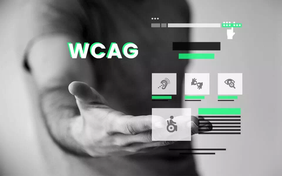
Far from being an optional upgrade, accessibility is the blueprint of modern digital interaction. Designing for screen readers, keyboard navigation, and color contrast is not just ethical, it’s commercially viable. By aligning layouts with WCAG guidelines, designers make products usable for a broader audience, including those with visual, auditory, motor, or cognitive impairments.
Accessibility should not be an afterthought patched in during QA. When baked into the wireframe stage, it ensures that every interaction works equally for every user. Whether it’s using sufficient label descriptions or ensuring dynamic content updates are screen reader-friendly, the real goal is universal usability.
Webdev200 recognizes this by prioritizing inclusive design principles across all client projects. Rather than adding alternate paths for users with disabilities, the company crafts interfaces that welcome everyone from the start. The result is a structure that’s not only equitable but also inherently stronger and more user resilient.
Responsive Layout with Meaningful Adaptation

It’s not enough to be technically responsive. True adaptability considers not just screen size, but context. A mobile user is likely on-the-go and has limited attention. A desktop user might be multitasking or deep-diving into product research. Both require interfaces tailored to those behavioral modes.
Instead of simply resizing columns, Webdev200 focuses on progressive layout evolution. Typography changes for readability, call-to-actions grow more prominent, and navigation patterns shift from top-heavy menus to gesture-friendly tiles or icons. Interaction zones become thumb-friendly, and transitions smoothen for device-specific touchpoints.
Browsers merely render the code. Human-centered design interprets usage intent and adapts accordingly. A fluid layout anchored in behavioral insights offers more than beauty, it offers purpose.
Design Psychology and Cognitive Load

Humans process visual data faster than text, but more isn’t always better. In fact, excess can paralyze decision-making. Understanding design psychology means curating experiences that are intuitive, predictable, and non-disruptive. Layouts must guide users from point A to point B with subtle nudges, not force.
Elements like spacing, contrast, hierarchy, and visual rhythm help users build mental maps. When a user visits a product page, they shouldn’t have to “figure out” where the price is. It should emerge naturally within the visual flow. This isn’t aesthetic fluff, it’s neuroscience applied to pixels.
Cognitive load is reduced when interfaces honor established mental models. Repetition of design patterns, such as a shopping cart icon always on the top right, eases learning curves. At Webdev200, this principle drives consistent interface logic, helping users trust and complete tasks more efficiently.
Microinteractions, animations, and iconography should all serve clarity. When they don’t, they detract. Every design decision must support cognition, not overwhelm it.
Interaction Design Across Digital Touchpoints

Modern interfaces are no longer confined to screens. Users now interact through voice, wearables, AR overlays, and beyond. These cross-platform touchpoints demand new frameworks for interaction design. It’s not just about clicks or scrolls but gestures, voice commands, and haptic feedback.
Creating an interface that feels natural in multiple environments requires anticipating use cases. What a smartwatch user needs from a fitness app is vastly different from a desktop dashboard experience. Webdev200 embraces multimodal interaction mapping as a core strategy. This ensures consistent branding, usability, and performance across every platform.
Each interaction is designed to reduce friction. For example, subtle sound cues on mobile confirm actions. Smart defaults reduce the number of steps to complete a task. Predictive design aids in guiding users before confusion sets in. By designing across digital ecosystems rather than just browsers, the user journey becomes cohesive, regardless of medium.
Intuitive Navigation and Contextual Feedback

A clear, predictable navigation structure is the spinal cord of any successful interface. Without it, users wander, bounce, and abandon. Navigation should act invisibly, seamlessly guiding users where they need to go. But intuitive doesn’t mean uniform, it means expected within context.
Webdev200 uses user behavior data to structure navigation hierarchies. Rather than following a rigid menu template, they tailor information architecture based on what matters most to real users. For some businesses, the search bar becomes the focal point. For others, category-based filtering drives conversions. Each layout adapts based on function.
Moreover, contextual feedback mechanisms help users understand the impact of their actions. Submitting a form without an error message is disorienting. A simple confirmation, animated checkmark, or real-time validation keeps the experience grounded in logic. When users feel acknowledged, they feel in control.
This kind of feedback builds trust. It reassures users that the interface is responsive not just in code, but in communication. And that level of subtle reassurance is often the deciding factor between continued engagement and abrupt exits.
Wrapping the Journey in Empathy and Insight
What differentiates functional design from phenomenal design is empathy. While many sites check the technical boxes, mobile ready, load-optimized, visually modern, few deliver experiences that feel personalized and respectful of human attention.
Designing for humans means listening, iterating, and anticipating. It means simplifying where possible, elevating moments that matter, and respecting the time, context, and preferences of every visitor. It’s in the microchoices, a clear label, an uncluttered interface, a well-timed call to action, where real loyalty is built.
Webdev200’s approach to human-centered design focuses not only on trends, but on what feels good, works well, and respects the audience. Each project is treated as an opportunity to create digital spaces that welcome, serve, and delight, one thoughtful detail at a time.

