
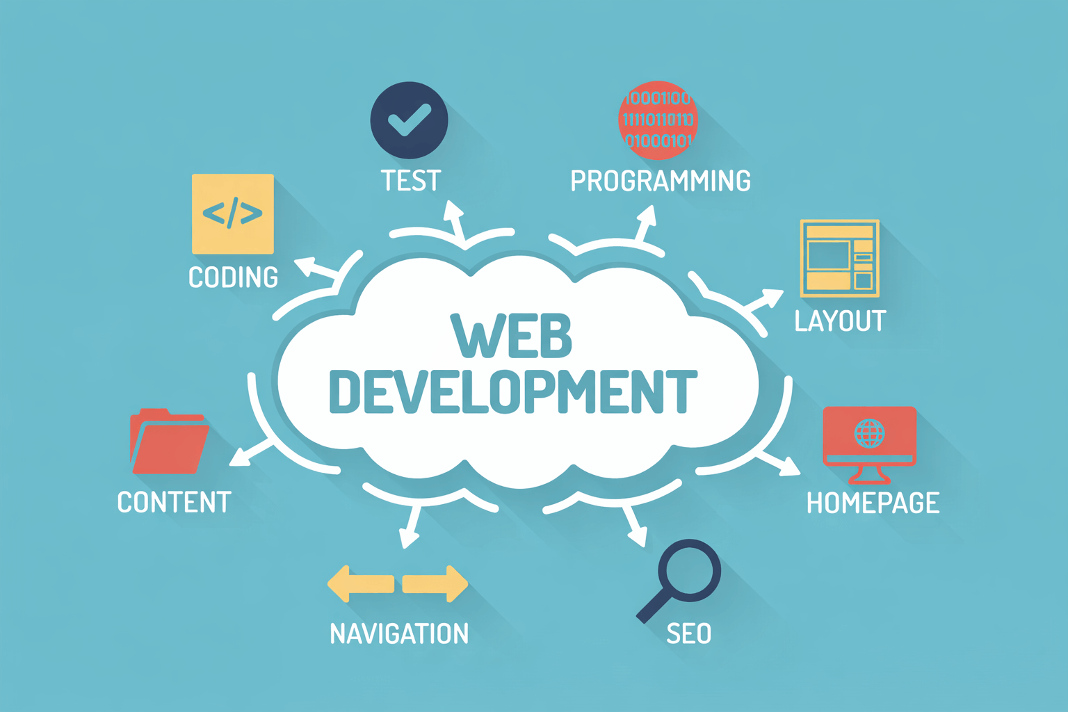
A Clear Starting Point for Mobile Thinking
Mobile experiences now shape how people interact with brands every day. Phones are no longer secondary devices. Instead, they are often the first place users engage with content, products, and platforms. Because of this shift, building for mobile requires more than shrinking a desktop layout. It requires intent, planning, and clarity from the beginning. WebDev200 approaches this reality by offering services that prioritize usability, performance, and long-term value.
Mobile thinking starts with understanding behavior. Users move quickly. They scroll, tap, and switch contexts often. Therefore, experiences must feel intuitive and responsive. Clear navigation, readable content, and purposeful interactions matter more on smaller screens. When teams acknowledge this early, development becomes smoother.
Another important factor is alignment. Mobile projects succeed when design, development, and strategy work toward the same goal. Without alignment, features feel disconnected. However, when planning stays focused, experiences feel cohesive.
Mobile also demands restraint. Less content often performs better. Simpler paths reduce friction. These choices support engagement rather than overwhelm.
A strong mobile starting point sets expectations for everything that follows. When teams plan intentionally, results feel more natural and effective across platforms.
Technical Foundations That Support Mobile Performance
Behind every strong mobile experience sits reliable technical work. Clean web development ensures pages load quickly and function correctly. Performance matters because mobile users expect speed. Even slight delays can cause drop-offs.
Mobile projects often integrate with business applications that handle data, workflows, and internal processes. These systems support functionality beyond the interface. When applications align with mobile goals, experiences feel seamless.
Scalability also matters. Mobile platforms must handle growth without disruption. Thoughtful architecture supports increased traffic and feature expansion.
Testing plays a critical role. Devices vary widely in size and capability. Teams must account for this diversity to maintain consistency. Thorough testing prevents errors and improves reliability.
Strong technical foundations create confidence. When systems work smoothly, users trust the experience. This trust supports engagement and retention over time.
Design Decisions That Shape Mobile Interaction
Design influences how users feel while navigating mobile experiences. Effective web design prioritizes clarity and simplicity. Layouts guide attention rather than compete for it. Visual hierarchy helps users understand what matters most.
Strong user experience focuses on interaction. Smooth transitions, intuitive gestures, and predictable behavior reduce frustration. When users feel comfortable, they stay engaged longer.
Accessibility also plays a role. Text must remain readable. Buttons must feel easy to tap. These details support usability for a broader audience.
Design choices influence perception. A polished interface communicates credibility. Users associate thoughtful design with reliability.
When design supports interaction rather than decoration, mobile experiences feel effortless. This ease encourages return visits and stronger engagement.
Adaptability and Visibility in a Mobile First Environment

Mobile experiences must adapt to different screens and contexts. Responsive design allows layouts to adjust naturally across devices. This flexibility supports consistency whether users access content on phones or tablets.
Visibility also matters. SEO influences how mobile content appears in search results. Search engines prioritize mobile-friendly experiences. Therefore, optimization supports discovery.
Performance affects visibility. Faster loading times improve rankings. Clean structure helps indexing. These elements support reach.
A strong online presence depends on accessibility. Mobile users expect content to load quickly and function smoothly. When expectations are met, engagement increases.
Adaptability and visibility work together. When mobile experiences perform well and remain easy to find, growth follows naturally.
Understanding Creation and Promotion in Mobile Projects

Mobile work often involves two distinct efforts. One focuses on building the application itself. Mobile development includes coding, testing, and deployment. The goal is functionality and reliability.
The other effort focuses on awareness. Promotion ensures users discover and engage with the application. These activities support adoption and growth.
Each serves a different purpose. Building focuses on execution. Promotion focuses on visibility. When teams understand this distinction, strategies become clearer.
Balancing both areas supports success. A strong product needs users. Awareness ensures the product reaches the right audience.
Understanding these roles helps teams allocate resources wisely. Mobile success depends on thoughtful creation and effective outreach.
A Practical Direction for Mobile Focused Growth
Mobile experiences influence how brands connect with users. Planning, technical stability, and thoughtful design all matter. WebDev200 supports mobile-focused growth by aligning strategy, execution, and usability through tailored services.
When teams invest in mobile intentionally, outcomes improve. Experiences feel cohesive. Users stay engaged.
If your organization is ready to strengthen its mobile direction, now is the time to explore what building for mobile can truly support.