
Every business needs a website, but it must also work well on mobile devices. Many people use their phones for browsing, shopping, and social media, so your website should look good and be easy to use on these devices.
A mobile-friendly website adjusts to fit different screen sizes. This means text should be clear, and buttons should be easy to tap without zooming. If your site isn’t mobile-friendly, visitors might get frustrated and leave, leading to lost potential customers.
Ensuring your website is mobile-friendly helps keep users engaged and encourages them to stay longer. It meets their needs and provides a better experience, which can boost sales and conversions. Plus, a mobile-friendly site can improve your search engine rankings, making it easier for new customers to find you online.

The Rise of Mobile Browsing
The number of people using mobile devices to access the internet has skyrocketed in recent years. In fact, more people now use their phones to browse the web than they do on computers. This shift means that if your website isn’t mobile-friendly, you’re missing out on a huge audience. People expect to find information quickly and easily on their phones. If your website is difficult to navigate or doesn’t load properly on mobile devices, users are likely to leave and find a competitor’s site that works better.
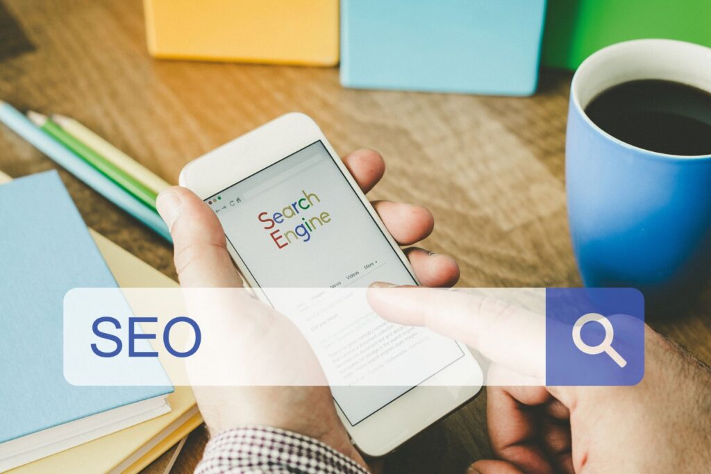
SEO Benefits of Mobile-Friendly Websites
Search engines like Google prioritize mobile optimized websites in their rankings. This means that if your website isn’t optimized for mobile, it could be pushed down in search results, making it harder for potential customers to find you. Google’s algorithm favors sites that provide a good user experience, and a big part of that is how well your site performs on mobile devices.
A mobile compatible website can help improve your search engine optimization (SEO) efforts. When your site is responsive, it loads faster, which is a key factor in Google’s ranking criteria. Faster load times lead to lower bounce rates, as users are less likely to leave a site that loads quickly. Additionally, a responsive design means you don’t need separate URLs for mobile and desktop versions of your site, which can simplify your SEO strategy.

Increased Conversion Rates
A mobile-friendly website can significantly increase your conversion rates. When users can easily navigate your site on their phones, they’re more likely to complete desired actions, whether that’s making a purchase, signing up for a newsletter, or contacting your business. If your website isn’t compatible to mobiles, users may abandon their carts or fail to convert due to frustration with the site’s functionality.
A responsive design makes it easier for users to complete forms, click buttons, and follow through with transactions. This ease of use can lead to higher conversion rates and more sales for your business. Additionally, a mobile compatible site builds trust with users. When your website looks professional and functions well on all devices, it gives users confidence in your brand.

Future-Proofing Your Website
As technology continues to evolve, so do the ways people access the internet. Mobile devices are only going to become more prevalent, and it’s essential that your website is prepared for this shift. By making your website mobile optimized now, you’re future-proofing your business against changes in technology and user behavior.
A responsive design ensures that your website will continue to look and function well on new devices, whether it’s a smartphone, tablet, or even a wearable device. This adaptability is crucial in a fast-paced digital landscape where user preferences and technology are constantly changing.
WebDev200 stays ahead of the curve by implementing the latest web design trends and technologies. We know that a mobile optimized website isn’t just a trend—it’s a necessity. By investing in a mobile-friendly design, you’re ensuring that your website remains relevant and effective for years to come.
Having a mobile optimized website is no longer optional in this modern digital age—it’s essential. With more people using their phones to browse the web than ever before, it’s crucial that your website provides a seamless experience on all devices. A mobile-friendly website not only improves user experience but also boosts your SEO, increases conversion rates, and future-proofs your business.
At WebDev200, we understand the importance of a mobile optimized website. Our team of expert web designers is dedicated to creating responsive designs that look great and perform well on all devices. We work closely with our clients to ensure that their websites meet the needs of today’s mobile users and stay ahead of the curve in a rapidly changing digital landscape.
By making your website compatible to mobiles, you’re not just improving your online presence—you’re setting your business up for success. Whether you’re looking to attract more visitors, improve your search engine rankings, or increase your conversion rates, an optimized for mobile website is the key to achieving your goals.
Invest in a mobile-friendly website today, and let WebDev200 help you reach more customers and grow your business. Contact us to learn more about our web design services and how we can help you create a website that meets the needs of today’s mobile users.