


Clear Brand Signals and Stronger Audience Recognition Today
A brand often changes long before its visual identity does. New products, audiences, goals, and values may reshape the business, while its logo, colors, images, and website still reflect an earlier stage. When that gap becomes obvious, a visual refresh can bring the public image closer to the brand people experience today.
However, change should never happen because a color or design style has become popular. Trends pass quickly, while a recognizable identity can build trust. Therefore, a company should first examine whether its current look still supports its message, audience, and market position.
One useful sign is inconsistency across customer touchpoints. As a result, customers may struggle to connect those materials with the same company. A refresh can create shared visual rules without removing the elements that people already recognize.
An outdated digital appearance can also weaken a strong business message. Small text, crowded pages, low quality images, or old layouts may suggest that the company pays less attention to its public image. That impression may not reflect the quality of its work, yet customers can form opinions within seconds. Updated web design can give valuable information more space and make the brand feel current.
Audience response offers another practical clue. If visitors leave key pages quickly, overlook calls to action, or repeatedly ask where to find basic information, the issue may involve more than written content. Confusing visual choices can make even accurate information hard to follow. Better user experience helps people understand the offer and decide what to do next.
Internal feedback matters as well. Sales teams, customer support staff, and content creators often notice recurring points of confusion before leaders do. Their observations can reveal weak image choices, unclear page order, or materials that no longer match current offers. The right creative services can turn those findings into a focused plan based on real needs.
Before approving any change, the company should identify what must remain familiar. A signature color, logo shape, type style, or photo approach may hold valuable recognition. Keeping the strongest parts creates continuity, while weaker parts receive careful updates. In this way, a visual refresh feels like natural progress instead of a sudden break from the past.
Visual Refresh Standards for Brand Value and Consistency
A thoughtful update starts with evidence rather than personal taste. Customer comments, website behavior, sales feedback, competitor reviews, and brand audits can show where the current identity falls short. For example, people may recognize the logo but find the site difficult to use on a phone. In that case, responsive design deserves more attention than a complete logo replacement.
The scope should match the problem. A minor update may adjust colors, type, image direction, page spacing, or social templates. A broader project may revise the logo system, voice, digital assets, and brand guidelines. Therefore, leaders should define the exact gap before choosing how much to change.
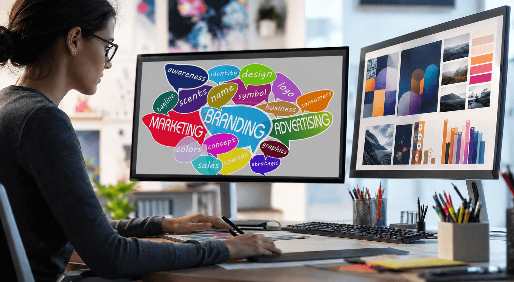
Strong marketing & branding connects each design decision with a clear business purpose. A brighter color set may improve visibility, while simpler page layouts may place more attention on key offers. Likewise, new photography may represent the company’s actual customers, work, or personality more accurately. Each choice should support recognition, clarity, and trust rather than decoration alone.
The website deserves special attention because it often brings together the full brand experience. Its copy, navigation, images, forms, and page design need to feel related. When one element looks current and another looks neglected, the difference can reduce confidence. A visual refresh should improve the whole experience instead of placing a polished surface over unresolved problems.
Search performance should remain part of the review. Design changes can affect page speed, mobile access, headings, image descriptions, internal links, and content placement. Consequently, teams should protect sound SEO practices while improving the visual system. A beautiful site offers limited value if search engines or potential customers cannot understand and reach it.
Consistency should also extend beyond the main website. Social profiles, business listings, email signatures, advertisements, proposals, and printed pieces should share recognizable visual cues. This alignment strengthens an online presence because customers receive the same impression wherever they encounter the brand. It also helps internal teams create new materials with fewer errors and less guesswork.
Accessibility is another essential standard. Text needs enough contrast, type must remain readable, and buttons should be easy to identify. Images also need useful alternative text, including a natural focus phrase when it accurately describes the image. For instance, an image alt attribute such as “visual refresh planning session for a growing company” supports context without forcing unnecessary keywords.
Testing can prevent expensive mistakes. Teams can compare page versions, ask customers to complete common tasks, and review the updated identity on different screen sizes. They should also check whether loyal customers still recognize the brand. These steps make the update more practical and grounded in actual behavior.
Confident Brand Direction Through Expert Digital Support

Once the need becomes clear, careful planning keeps the project focused. The company should document its goals, audience, current problems, valuable brand assets, and required applications. It should also set review points for copy, visual work, and technical changes. This shared brief gives every contributor a clear basis for decisions.
An experienced web developer can then assess how proposed updates will work in a real digital setting. Some ideas may look strong in a static concept but become slow, unclear, or difficult to manage online. Technical review helps protect speed, mobile use, accessibility, and future content needs.
Likewise, site development should support the refreshed identity through useful, accessible, flexible, and reliable digital functions, not visual changes alone. Clear menus, simple forms, logical page order, and reliable performance help the new look serve customers. Together, design and function help visitors understand the company, explore, inquire, or return.
Companies should plan the rollout with equal care. Updating every channel at once can create a clean launch, although a phased release may suit a larger organization. In either case, teams need current files, simple guidelines, and clear dates. Retiring old assets quickly prevents mixed versions from weakening the refreshed identity.
After launch, measurement should continue. Teams can review engagement, form completion, search visibility, customer questions, and direct feedback. Positive movement can confirm that the update solved the intended problems, while weak results may point to areas that need refinement. Careful measurement turns the launch into an informed improvement rather than a one day reveal.
Webdev200 can help businesses connect brand direction with a practical digital experience. The team can review how visual choices, content, and site functions support one another, then shape improvements around clear business needs. This approach helps preserve familiar strengths while correcting signs of age, confusion, or inconsistency. It also gives the refreshed brand a useful place to perform.
Ultimately, the right time for change appears when the current identity no longer represents the business clearly or helps customers move forward. A thoughtful update should increase recognition, relevance, ease, and trust without discarding valuable history. If your brand feels disconnected from its present direction, contact us to discuss a focused refresh that clearly supports both your message and your customers.