

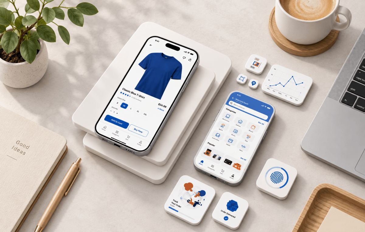
The Small Screen Details Behind Stronger Shopping Decisions
Shopping on a phone can feel effortless when every part of the screen has a clear purpose. A shopper sees an item, understands its value, checks important details, and knows what to do next. However, that simple experience depends on many careful choices working together behind the screen.
A strong mobile product screen gives shoppers useful information without making them search for it. Important details need clear placement because mobile screens offer limited space. Therefore, businesses must decide what deserves immediate attention and what can appear farther down the page. Price, availability, useful product details, and purchase options often need strong visual priority.
Webdev200 approaches digital experiences with this wider picture in mind. A product screen should support both business goals and customer needs. For example, shoppers should not have to guess whether an image opens, where additional details appear, or how they can continue toward a purchase. Instead, each action should feel natural from the first glance.
Visual content also carries more responsibility on smaller screens. Clear product images can help shoppers examine an item without depending on long descriptions. At the same time, useful text can answer questions that visuals cannot. Therefore, the strongest screens balance both forms of information instead of allowing one to overwhelm the other.
Speed matters as well. Shoppers may leave when a screen responds slowly or makes basic actions difficult. In addition, unnecessary elements can compete with the information that actually helps someone make a decision. Simplicity becomes valuable when it removes friction rather than removing useful details.
Ultimately, a high converting screen is not simply a smaller version of a desktop page. Mobile shoppers interact differently because they tap, swipe, scroll, and often browse while doing other things. Consequently, the experience needs careful attention to space, clarity, and action. When those details support each other, a small screen can create a direct and useful shopping experience.
The Mobile Principles Behind Clearer Purchase Decisions
Mobile development plays a central role in turning product information into a practical shopping experience. It considers how screens behave on mobile devices and how shoppers interact with them through touch. Therefore, technical choices can directly affect whether someone continues browsing or gives up before completing an action.
Good mobile development starts with clear priorities. A shopper should quickly understand what the product is, why it may suit a need, and which action comes next. However, placing every detail at the top can create clutter. Instead, information should appear in an order that supports natural decision making.

This principle becomes especially important in mobile commerce. Customers may compare several products within minutes. They may also move between search results, product details, reviews, and purchasing options. As a result, the experience should reduce unnecessary steps while still giving shoppers enough information to make informed choices.
Clear mobile navigation supports that goal. Menus, back controls, product categories, and other navigation elements should respond predictably. Moreover, tap targets need enough space for easy selection. Small or crowded controls can lead to mistakes, which creates frustration at a point where the business wants customers to stay engaged.
The purchase process deserves equal care. A simple checkout experience can reduce avoidable friction after someone has decided to buy. Forms should request only necessary information, instructions should remain clear, and customers should understand their progress. In addition, errors should be easy to identify and correct.
Performance supports all of these decisions. Large assets, unnecessary scripts, and poorly planned features may slow a screen. Therefore, teams should consider speed throughout development rather than treating it as a final adjustment.
A useful mobile experience feels simple because difficult decisions have already happened behind the scenes. Developers have considered screen limits, touch behavior, loading demands, and customer expectations. Consequently, shoppers can focus on the product rather than the technology supporting it. That invisible efficiency can make mobile buying feel much more natural.
The Interactive Details Behind Confident Customer Actions
A mobile screen becomes more useful when shoppers can interact with information in ways that support a decision. Interactive experiences can include image galleries, size choices, quantity controls, expandable details, product options, and other responsive elements. However, every interaction needs a clear reason. Features should help shoppers rather than simply make a page feel busy.

The Interactive service connects closely with this goal because customer actions form an important part of the shopping journey. For instance, someone may swipe through images, select an option, open additional information, or check availability. Each response should happen quickly and clearly. Otherwise, uncertainty can interrupt the buying process.
A well planned product page also gives visual priority to the actions that matter most. Product information may be detailed, but shoppers should still know where to look first. Therefore, typography, spacing, buttons, and visual grouping can guide attention without relying on excessive decoration.
The primary call to action deserves particular care. Its wording should explain what happens after a tap, while its placement should make it easy to find. Still, repeating large buttons everywhere can create unnecessary pressure. A better approach keeps the main action visible when it becomes relevant to the shopper.
Businesses often watch the conversion rate to understand how many visitors complete a desired action. Yet that number should not encourage manipulative design. Instead, teams can study where shoppers encounter friction and improve legitimate usability problems. For example, unclear product choices, confusing controls, or difficult forms may prevent interested customers from moving forward.
Feedback also strengthens interactions. When shoppers select an option, the interface should show that their choice is registered. Likewise, when something goes wrong, a clear message can explain what needs attention. These small responses reduce uncertainty.
Ultimately, useful interaction makes the screen feel responsive without demanding extra thought. Shoppers can explore information at their own pace, understand their choices, and move forward when ready. That balance supports both customer confidence and meaningful business results.
The Final Essentials for a More Purposeful Mobile Experience
High converting mobile experiences come from many small decisions rather than one dramatic feature. Clear information, useful visuals, quick responses, simple controls, and dependable performance all contribute to the final result. Therefore, businesses should evaluate the whole shopping journey instead of judging a product screen only by its appearance.
The best experiences respect the shopper’s time. People should be able to understand an item without working through confusing menus or oversized blocks of information. At the same time, businesses should provide enough detail for informed choices. Finding that balance makes the screen useful rather than merely minimal.
Trust also develops through consistency. Prices should remain clear. Selected options should stay visible. Buttons should behave as expected. Likewise, important information should not disappear behind confusing interactions. When the interface responds predictably, shoppers can spend more attention on deciding whether the product fits their needs.
Businesses can also learn from real customer behavior. Testing can reveal where people hesitate, leave, make errors, or repeatedly return to the same information. Therefore, teams can improve specific areas based on evidence instead of assumptions. Even small changes can make a screen easier to understand when those changes address genuine friction.
Mobile experiences also need ongoing attention. Devices change, customer expectations develop, and businesses introduce new products or buying options. Consequently, teams should review performance and usability over time. A screen that worked well before may need thoughtful updates as customer habits shift.
Most importantly, high conversion should come from making the shopping process clearer, not from pushing customers into decisions. Useful information and straightforward interactions create a better foundation for sustainable results. They allow shoppers to understand what they are considering and choose their next action with confidence.
Webdev200 can help businesses bring mobile functionality and meaningful interaction together in experiences designed around real customer needs. From product discovery through purchase decisions, every screen can have a defined purpose. For support creating smarter mobile experiences that connect usability with business goals, contact us.